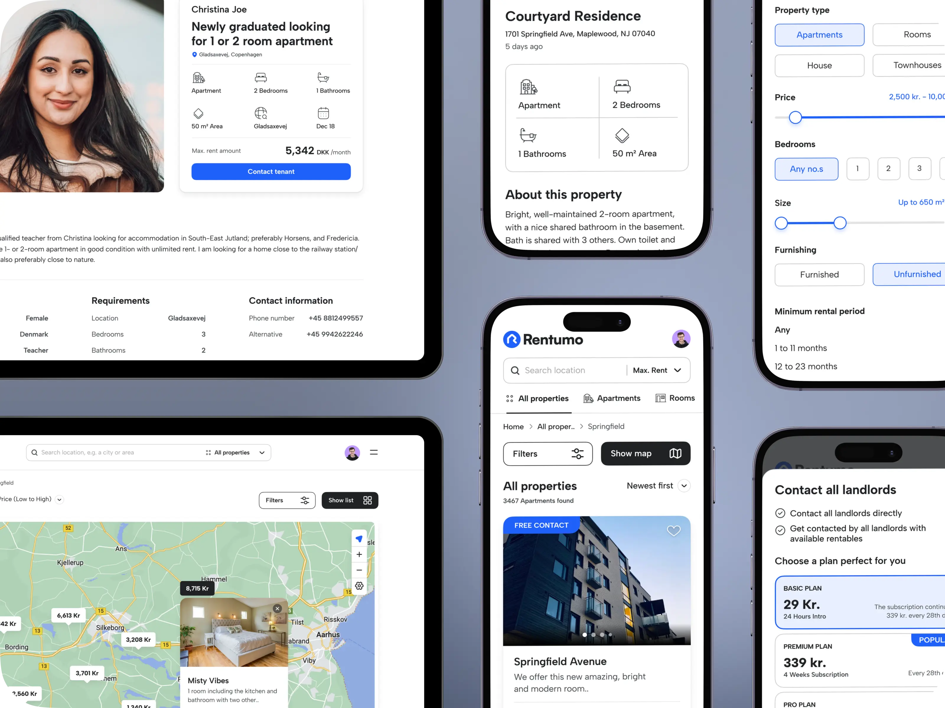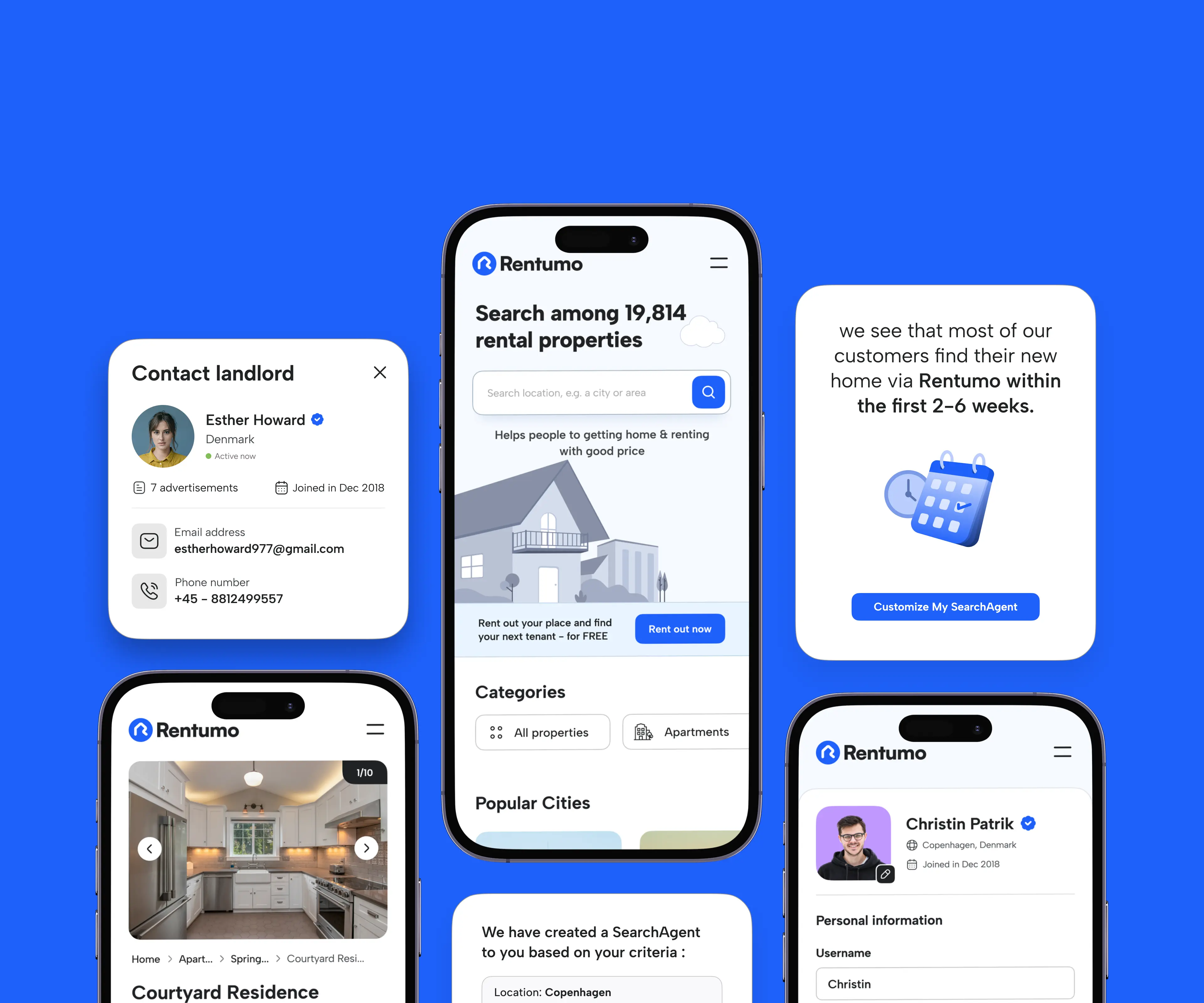
A property search website needs to be visually appealing to attract potential customers, but it also needs to be user-friendly and easy to navigate. Finding the right balance between aesthetics and functionality can be a challenge.

The site and app should be easy to navigate, with clear and intuitive menus, search filters, and calls-to-action. Instead of overwhelming the users with a ton of information, present the most relevant information in a clear and concise manner, enabling them to compare various offerings and make decisions.
Clean and clutter-free interface with information presented in a neat and organized manner. Because the goal is not to keep the user on the website, but to help them achieve their goal fast and be on their way.

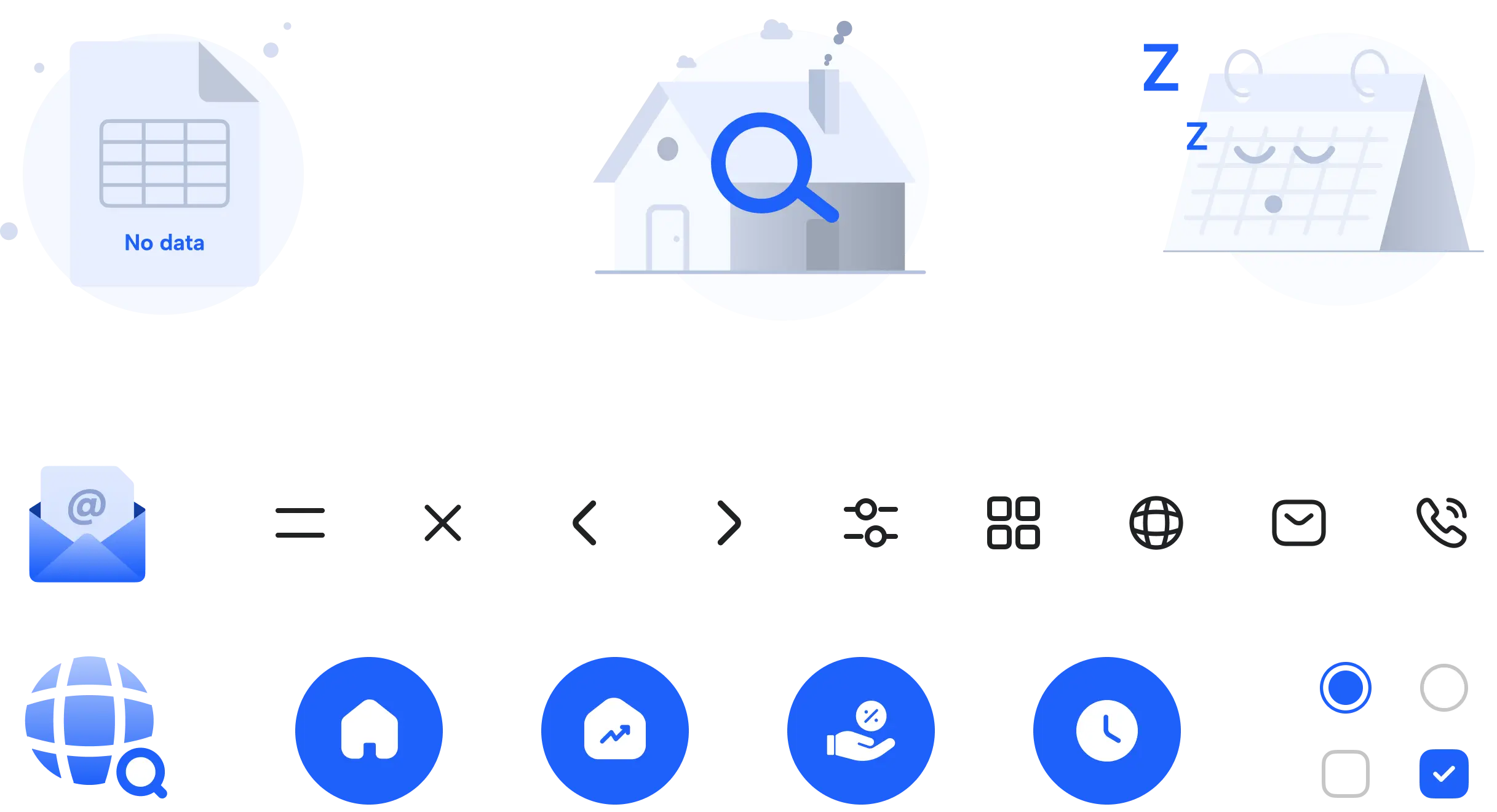
Modern icons and colour palettes were used with proper use of whitespace. Instead of using a lot of different colours, various hues of the primary and secondary colours were used throughout for a lean and professional feel with the focus being on the content rather than the UI.

